
Design Breakdown: Capturing Olympic Energy in “Ring Leaders”
Tackling a multi-page spread with 25 distinct profiles is a classic editorial design challenge. In my own day-to-day work focusing on editorial and photo illustration, I’m constantly analyzing how other designers balance chaotic, high-stakes visual energy with a clean, readable structure. The recent “Ring Leaders” feature in 5280 magazine (February 2026), highlighting our local Colorado athletes heading to the Winter Games, hits that mark perfectly.
Here is a breakdown of my strategies to create a clean easy to read feature.
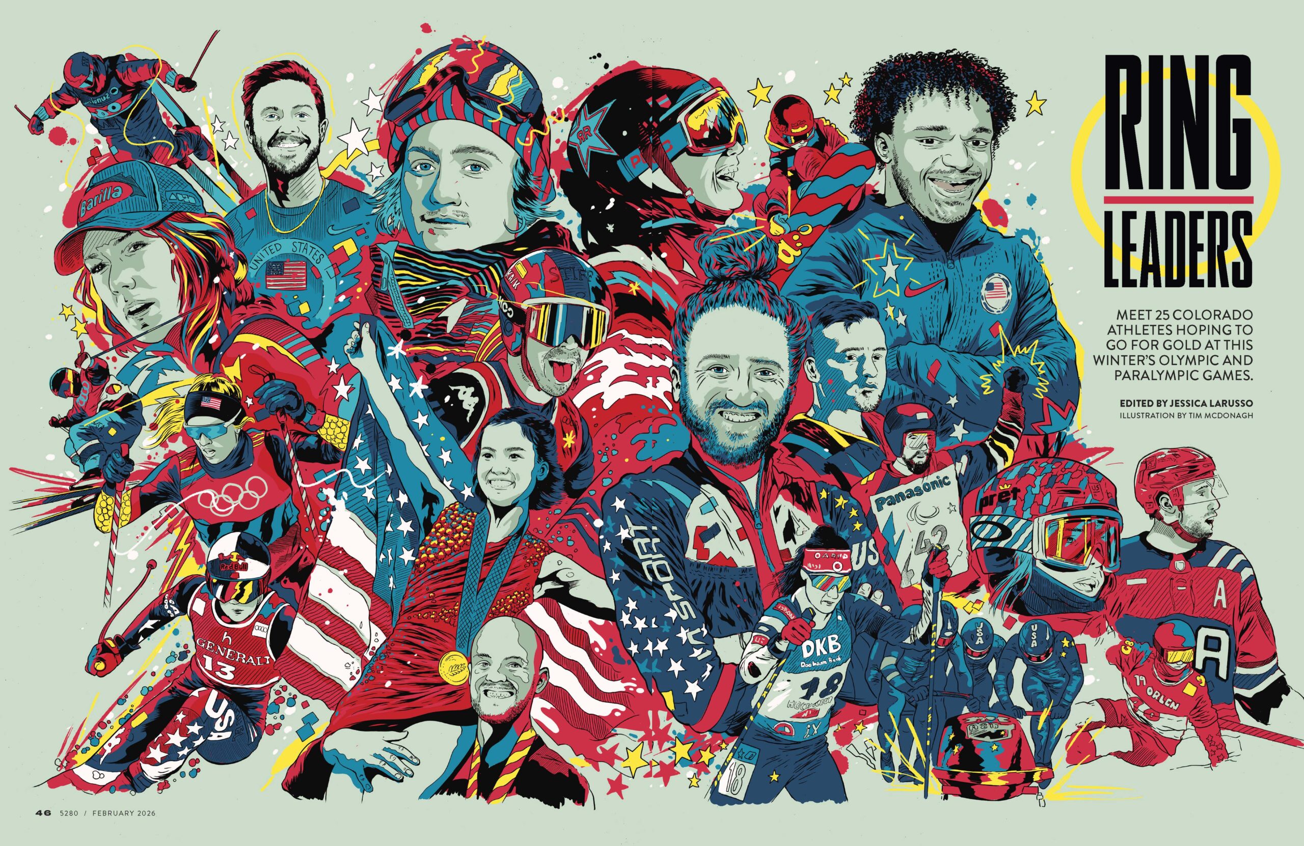
The Opening Hook: High-Voltage Illustration
The feature kicks off with a massive, high-impact illustration by Tim McDonagh.
Instead of relying on a standard photographic collage, McDonagh uses a vibrant, comic-book-inspired style with heavy black inking. The limited, punchy color palette—dominated by cyan, vivid red, and golden yellow—creates a massive sense of kinetic motion. It brilliantly unifies 25 distinct athletes, tying Alpine skiers, sled hockey players, and figure skaters together into one cohesive, superhero-esque squad. It is a masterclass in using stylized portraiture to set a dynamic tone before the reader even reads a single word.
The Interior Spreads: Grid & Typography
Transitioning from a wild illustration to a text-heavy layout could easily feel disjointed, but the interior spreads handle this beautifully.
- The Grid: The layout shifts to a structured, modular grid set against a muted, cool-toned background. This gives the eyes a needed place to rest after the explosive opening page.
- Typography: The typography does exactly what it needs to do: guide the reader. Use of bold type with bright background colors pulls the eye to the important details name and events.
Bridging the Gap: Graphic Elements & Photography
What makes this feature truly successful as a complete editorial package is how it weaves elements from the opening illustration through the rest of the photography-driven pages.
- Action Photography: The photos are dynamic, with many athletes clipped out of their backgrounds so they break out of their invisible bounding boxes, mimicking the layered, dimensional feel of the opening illustration.
- Playful Motifs: Bold yellow rings framing the athlete headshots, these subtle graphic touches pull the pop-art aesthetic from page one all the way through to page seven.
It’s a fantastic example of cohesive layout planning—letting the illustration do the heavy lifting for the “wow” factor, while keeping the interior structure functional, clean, and deeply engaging.


Leave a Reply